Cattle producers should see a bit of relief from high feed expenses over the next few months. The CME DEC ’22 Corn contract has fallen from a contract high of $7.64/bu. on May 16 to $6.23/bu. Some other commodities used in feed rations, such as distiller’s grains, have seen similar downward moves. These feed price changes can have a compounding impact on feeder cattle prices. As inputs become cheaper, feeder cattle become a relatively more profitable investment which lifts their value. It is common to see corn and feeder cattle prices move in opposite directions.
In the chart below, the CME DEC ’22 Corn price (black line) has declined significantly from mid-June to now. Corn is a significant input in feeding cattle and the CME OCT ’22 Feeder contract (green line) experienced a corresponding increase in value.
Since the contract high two months ago, cost of gain (COG) has fallen significantly while feeder cattle also became relatively more profitable. If COG is calculated:
then estimated COG, including yardage, fell from $1.11/lb. to $0.90/lb. from mid-May to the present, providing at least $0.20/lb. additional revenue before even considering the change in value of feeder and fed cattle. This also makes dry-lotting cows and placing lightweight cattle on feed a more feasible option given low pasture availability and historically high price of forage.
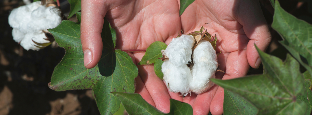
The cotton futures market is on the decline, having experienced a dramatic selloff starting June 17, 2022. As shown in Figure 1, December 2022 Cotton Future prices dropped from the May 17, 2022 high of 134 cents per pound to around 120 cents per pound on June 15, 2022, only to be followed by a plunge to a low of 91.2 cents per pound on June 28, 2022. The selloff has created concerns among cotton producers about this year’s profitability. What was the cause of the recent market plunge?
Figure 1. December 2022 Cotton Future Prices for the Past Year
Source: barchart.com
Since September of last year, the cotton futures market experienced an inflow of speculative money, which pushed cotton prices to levels that exceed those indicated by supply and demand fundamentals (more information here). The flow of speculative money in and out of cotton markets makes prices unpredictable and volatile. However, with the recent speculative money leaving the cotton market, prices fell sharply, possibly with a temporary correction below the price supported by global cotton supply and demand fundamentals. What caused this sudden withdrawal of money from the cotton market?
Cotton and cotton-related products are discretionary items. Thus, cotton prices tend to follow the economy, with cotton prices rising during economic growth and declining during recessions. Many economic indicators point to the direction of a global economic slowdown, with the possibility of a recession in the United States. The S&P 500 index, one of the main indexes for the U.S. stock market, recorded a 20% drop in June from its January closing peak to confirm a bear market. Meanwhile, soaring inflation put extra pressure on consumers. The annual inflation rate in the U.S. accelerated to 8.6% in May of 2022, the highest since December 1981. Embedded in inflation, energy prices rose 34.6% and food costs surged 10.1%. Severe supply disruptions caused by geopolitical tension and Covid-19 reduced global economic productivity, hindered the ability to meet consumer demand, which resulted in an economic slowdown and high inflation rates globally.
The soaring inflation, especially for food and energy, reduced consumer confidence and forced the consumer to rebalance their budgets for spending. This could lead to consumers reducing the purchase of apparel and apparel-related products. Meanwhile, in response to high inflation, the Federal Reserve increased the federal funds rate to tamp down inflation – on June 15th the Federal Reserve increased interest rates by three-quarters of a percentage point, its largest rate increase since 1994 and the third rate increase in 2022. The Federal Reserve’s commitment to bringing inflation back down to its target of 2% indicates a strong possibility of further interest rate hikes in 2022 and 2023. The rising interest rate further accelerated the appreciation of the U.S. dollar, as the U.S. Dollar Index reached its three-year high at 104.01. Cotton is a global commodity; on average, over 80% of cotton produced in the U.S. is exported. The appreciation of the U.S. dollar increases prices paid by foreign consumers and makes U.S. cotton less attractive. All of these concerns contributed to the withdrawal of money from the cotton market and the recent decline in cotton prices from the peak.
The impact of this year’s global cotton production on prices is yet to be seen. High cotton prices during the planting season attracted more cotton planted acres globally. However, the Southwest United States, the major cotton-producing region in the U.S., is experiencing severe drought and is anticipating lower production this year. Globally, the USDA June forecast for cotton production could reach 121.3 million bales, 4 million bales larger than last year. The projected USDA global ending stocks are maintained at a relatively low level at 82.7 million bales. Lower cotton production in the U.S. could provide some support for harvesting prices domestically. However, with a higher global cotton production forecast, global cotton prices could drop further if the global economy enters a recession and stock markets continue to experience losses for the remainder of this year.
Producers who are not in a marketing pool are encouraged to develop a marketing plan to protect the harvest price, as it is risky to lock in high input prices without a marketing plan for the crop. In addition, producers can adjust their harvest price expectations and manage their in-season production decisions accordingly.
Since 2000, Ag Co-ops have accompanied the growth of the agricultural sector[1]. With a business volume of $118.900 billion in 2000 and $203.047 billion in 2019, they expanded their activity by 2.68% per year on average, i.e. 0.57% when adjusted for inflation[2]. This is slightly lower than the 0.64% growth of output produced by farmers over the same period. In the same time, the concentration of the sector kept going: there were 3,338 co-ops in 2000 and only 1,779 in 2019, i.e. a decrease of 3.15% per year. The membership of ag co-ops decreased by 2.45% while the total number of farmers decreased by 0.37%[3]. As a whole, ag co-ops are losing ground in agriculture but remain prevalent: the total membership in ag co-ops is 1.89 million in 2017[4] while the total number of farmers is 2.04 million.
The dynamics of co-op demographics are different from one industry to another though. In the grain and oilseeds industry, cooperative memberships decreased by 2.37% annually (0.29%[5] less than the 2.66% decrease of farmers). As such, the proportion of cooperative members among grain farmers had increased between 2002 and 2017. By contrast, membership in dairy co-ops decreased by 3.67%, which is 2.17%[6] more than the 1.50% decrease of the number of farmers in the same period. In the livestock industry, the proportion of co-op members dropped. Indeed, membership in co-ops decreased by 3.77%, which is 3.23%[7] more than the 0.54% decrease of the number of farmers.
To understand the current dynamics, we may focus on more recent financial trends. In terms of business volume, grain and oilseeds co-ops experienced an 8% growth per year between 2015 and 2020, mostly gained in 2018. Dairy co-ops saw their business volume increase steadily since 2015 by 4% per year. By contrast, the business volume of livestock co-ops decreased by 6% per year over the same period.
While livestock co-ops have divested (-2% in fixed assets since 2015), dairy and grain and oilseeds co-ops have invested to grow. Since 2015, grains and oilseeds co-ops added 14% in fixed assets, and dairy co-ops added 10%. Interestingly, their investments outpaced their growth in business volume, showing that investment efforts not only follow the need to deal with higher volume but anticipate further growth (see figure 1).
Next, it’s important to determine how growth is financed, first by focusing on the level of long-term debt over equity (figure 2). The dairy co-ops increased significantly the level of long-term debt compared to equity, with a ratio rising from 0.80 to 1, between 2014 and 2020. Grain and oilseeds co-ops keep their ratio of long-term debt at a very steady and low level, with a ratio of long-term debt over equity around 0.3. The livestock co-ops have increased their level of long-term debt, albeit absent of growth.
While grain and oilseeds co-ops are able to finance their growth without altering their financial ratios, the dairy co-ops rely on a higher level of debt compared to equity. This higher commitment of banks in the financing of investments had been accompanied by an effort of co-op members to increase retained earnings instead of allocated equity: The increase of retained earnings has more than outpaced the level of debt; figure 3 shows that the ratio of long-term debt of retained earnings dropped from 3.87 to 3.10 since 2014. The dynamic is different for livestock co-ops, where the ratio of long-term debt over retained earnings is increasing since 2017 albeit absent of growth. It may be interpreted as a transfer of funds from banks to co-op members, a support which may be not sustainable over the long run.
Overall, these numbers illustrate the success of co-ops in the grain and oilseed industry. They are able to grow without altering their leverage ratios nor their margins, i.e. without adding financial risks. From this, we can conjecture that the co-op membership share will maintain or grow in the mid run in the grain and oilseeds industry.
Dairy co-ops seem to have experienced a rebound. Indeed, their very dominant position among farmers may have flinched, but the financial performances of the most recent years and the efforts of members to finance the growth of their co-ops may put an end to a relative loss of ground.
The diagnostic is less positive for livestock co-ops. While they have the possibility to create value by exploiting low but steady gross margins, their divestiture and decreasing retained earnings may reflect a lack of commitment (which may also result from financial difficulties) of members to their co-ops, a sort of resignation. This decline is tempered by the support of banks, but it cannot last forever.
[4] Note that farmers can be member of several cooperatives, first-tier cooperatives are considered as members of second-tier cooperatives and some members may be not included in the count of farmers in the USDA census report. As such, we can compare evolution but the data does not allow us to estimate proportion.
[5] Ibid. Based on these data, co-op members represent more between one third and one half of the grain industry.
[6] Ibid. Based on these data, co-op members represent about three quarters of the dairy industry.
[7] Ibid. Based on these data, co-op members represent less than 5% of the livestock industry.
In May 2022, the Congressional Budget Office (CBO) released its latest 10-year budget projections for a number of Federal programs, including farm-related programs and the Supplemental Nutrition Assistance Program (SNAP). While CBO typically updates its budget projections up to three times per year, the spring update following the release of the President’s budget is most closely watched as it typically is the baseline against which the cost of legislative proposals is “scored” throughout the year.
During farm bill reauthorization years, CBO typically also releases their baseline projections by farm bill title. That summary gives policymakers a clear picture of the budget for mandatory spending they have to work with in each title of the farm bill. That estimate also gives a clear picture of what CBO expects the entire farm bill to spend if existing policies were simply maintained going forward.
While we are still a year out from CBO releasing baseline projections by title, there is still plenty to be gleaned from the May 2022 baseline update. For example, if we look back to the April 2018 baseline (the scoring baseline for the 2018 Farm Bill), the spending projections for CCC Price Support and Related Activities, Conservation, SNAP, and Crop Insurance accounted for $865.9 billion (Table 1), or 99.85% of the $867.2 billion in projected total baseline outlays for the farm bill.
Applying the same methodology to the most recent May 2022 baseline update, those four categories are projected to spend approximately $1.3 trillion over the next 10 years (Table 1). The significant increase is due to a 66.4% increase in projected spending on SNAP, with SNAP now projected to account for $1.1 trillion, or 84% of the total farm bill baseline. By contrast, the income support provisions for agricultural producers that make up the largest component of Title 1 – the Agriculture Risk Coverage (ARC) and Price Loss Coverage (PLC) programs – are projected to spend $43.3 billion over the next 10 years, or just 3.3% of the total farm bill baseline.
Table 1. Congressional Budget Office (CBO) 10-Year Outlays in Million$
April 2018
May 2022
Change($)
Change (%)
CCC Price Support & Related 1/
64,305
71,092
+6,787
+10.6%
Conservation
59,689
59,216
-473
-0.8%
SNAP 2/
663,828
1,104,384
+440,556
+66.4%
Crop Insurance
78,037
79,761
+1,724
+2.2%
Total
865,859
1,314,453
+448,594
+51.8%
1/ CBO included $10 billion in “Other Administrative CCC Spending” in the May 2022 baseline update. 2/ Revised economic assumptions and administrative changes to the Thrifty Food Plan (TFP) resulted in the Office of Management and Budget (OMB) projecting an additional $254 billion in SNAP outlays from FY2022-31 (https://www.whitehouse.gov/wp-content/uploads/2021/08/msr_fy22.pdf).
When referencing prices, nominal simply means the actual quoted price of a good at a given time. Real is a concept used to remove the inflation effect on prices and compare the true value of a good in different time periods. For example, the US average price of gasoline recently hit $5/gallon. To truly understand how expensive today’s prices are, we would have to account for inflation and adjust past gas prices to be quoted in 2022 dollars. The inflation adjustment makes it a “real” value comparison.
Real and Nominal also have a unique meaning when it comes to interest rates, and again inflation is a key component. Nominal interest rates are the value you see quoted for a loan, a certificate of deposit, or yield on a bond. The total nominal interest rate is made up of several components: the real interest rate, a risk premium, and expected inflation. The real interest rate is the underlying cost of using someone else’s capital for a period of time. The risk premium accounts for the uncertainty of the loan due to the credit worthiness of the borrower and/or how the loan is to be used. Finally, expected inflation is added to account for the change in purchasing power between original loan proceeds and the loan repayment at a later date. If, for example, a lender was expecting 5% inflation over the next year, the real interest rate was around 1.5%, and the risk premium was another 1% (the lender thinks the borrower is a trustworthy fellow), he would quote a nominal interest rate of 7.5%.
Expected inflation is an important part of the greater economic picture today. Peoples’ feelings and expectations about future inflation influence how they buy, sell, borrow, lend, and negotiate prices in the market place. In no small part, expected inflation can create a self-fulfilling prophesy. All of this brings us to an interesting bit of economic data that gives us a hint at today’s market expectations for inflation. Nominal interest rate quotes are readily available, but the components as described above are not transpartent in those quotes; at best, they can be estimated. One such estimate is known as the TIPS spread or the 5-Year Breakeven Inflation Rate. TIPS refers to Treasury Inflation-Protected Securites which are adjusted to offset inflation. The nominal yield for regular Treasury notes includes real interest rates, virtually no risk, and market expectations for inflation. The yield on TIPS has the same components but excludes expected inflation, therefore the market’s expectation of inflation is revealed in the spread, or yield difference, between the two types of notes. Figure 1 shows the TIPS spread on five-year Treasury notes over the past twenty years. The TIPS spread quickly rose from near zero at the onset of the pandemic to a high of 3.5% in mid to late March. The spread has since fallen back to around 2.75% as of last week. The decline over the last three months coincides with the Fed’s more aggressive action to fight inflation. It’s too early to tell if the Fed’s higher interest rates are slowing down inflation, but this early indication in the TIPS spread suggests market expectations are improving with regard to inflation. If your glass if half full, it’s an encouraging step it the right direction. If your glass is half empty, a decline in inflation expections also reflects a growing concern about a future recession. In reality, both interpretations are relevant regardless of how much water is in your glass.
Figure 1. Daily Yield Difference between Regular and Inflation-Protected 5-Year Treasury Notes